Design System Rework & Integration
Problem
The organization was operating with a legacy design system that had been built primarily from a developer’s perspective, resulting in a significant "design-to-code" disconnect. The system lacked any documentation within Figma—existing only in README files inaccessible to the design team—and featured components that prioritized looks over user experience and visual hierarchy. Because the system wasn't built on a foundation of design tokens or variables, there was no shared language between departments. This led to a bloated library of redundant components and inconsistent patterns that ignored established UX best practices.
Challenge
Perform a comprehensive "rescue" and audit of the existing design system. The goal was to remove the technical bloat, bridge the communication gap between design and engineering, and rebuild a scalable, tokenized architecture that prioritized both function and ease of use..
Opportunity
This project provided the chance to transform a technical bottleneck into a collaborative, high-performance design ecosystem. By advocating for a "Design-as-a-Product" approach, I focused on several key strategic fixes:
- Centralized Documentation: I moved the system’s knowledge base out of siloed README files and into a public-facing Figma files and Storybook instance. This gave stakeholders, designers, and developers a single, transparent source of truth for the first time.
- Tokenization & Variables: I overhauled the system’s foundation by implementing a design token architecture. By introducing variables for color, spacing, typography, etc. I created a consistent, automated language that synchronized Figma styles directly with the codebase.
- Component Rationalization: With the help of A.I., I conducted a full audit to eliminate "component bloat." I deprecated redundant elements and replaced them with flexible, multi-purpose components that followed industry-standard UX patterns, making the library significantly leaner and easier to maintain.
- Bridging the Gap: By translating the developer-centric logic into a designer-friendly UI kit, I fostered a culture of collaboration. This ensured that new features followed existing patterns rather than creating one-off solutions, drastically reducing future design and technical debt.
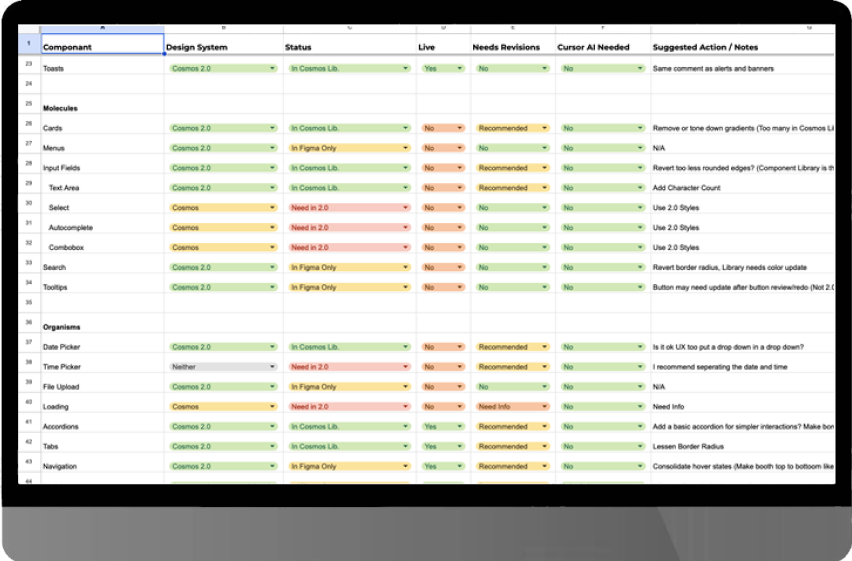
Product Audit and Research
I conducted a deep-dive audit to map existing flows and surface inconsistencies buried in the legacy technical debt. By layering in an accessibility review and available research, I identified critical gaps and prioritized the most urgent fixes. This turned a fragmented, developer-heavy interface into a clear, actionable roadmap for a streamlined user experience.
Creating the Foundation
Using the data from my initial audit, I rebuilt the system's foundation from the ground up, focusing on the specific updates needed to streamline the user experience. Collaborating with developers insured that naming conventions were consistent in both Figma and Storybook.
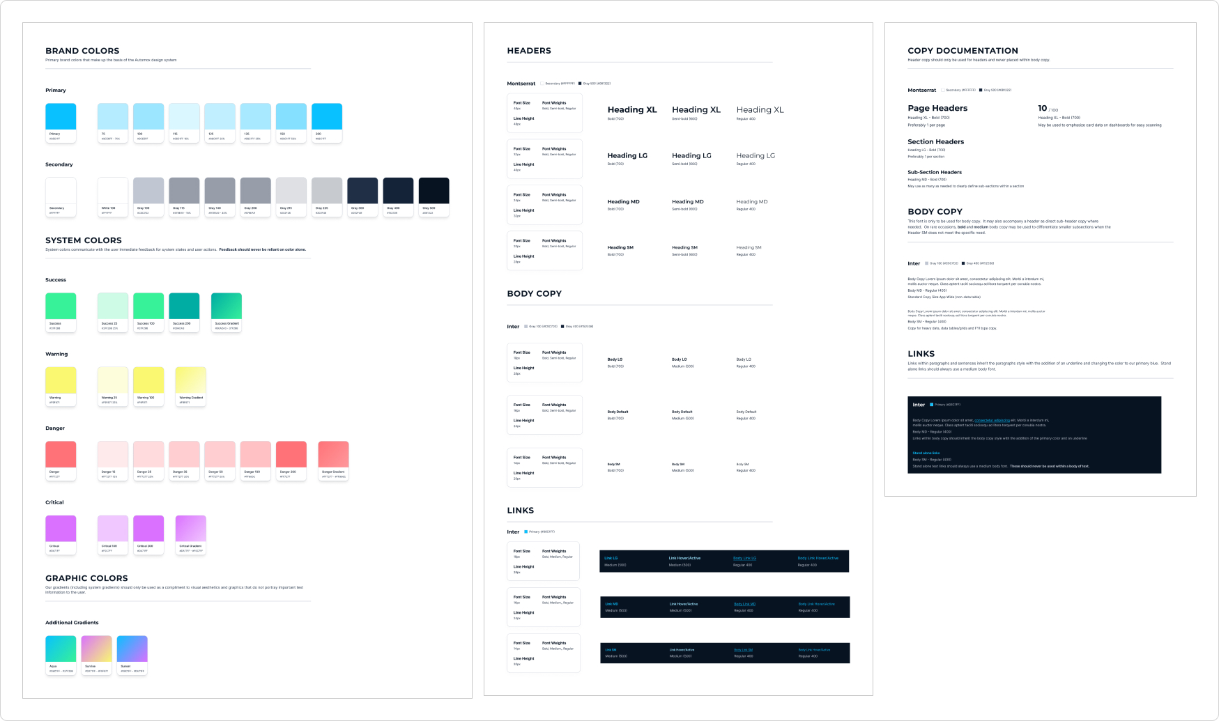
New Brand Variables (Colors, Typography, & Scale)
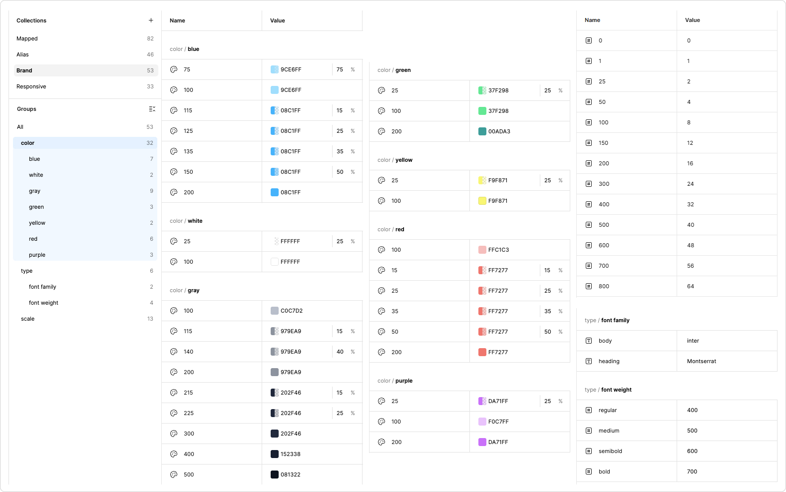
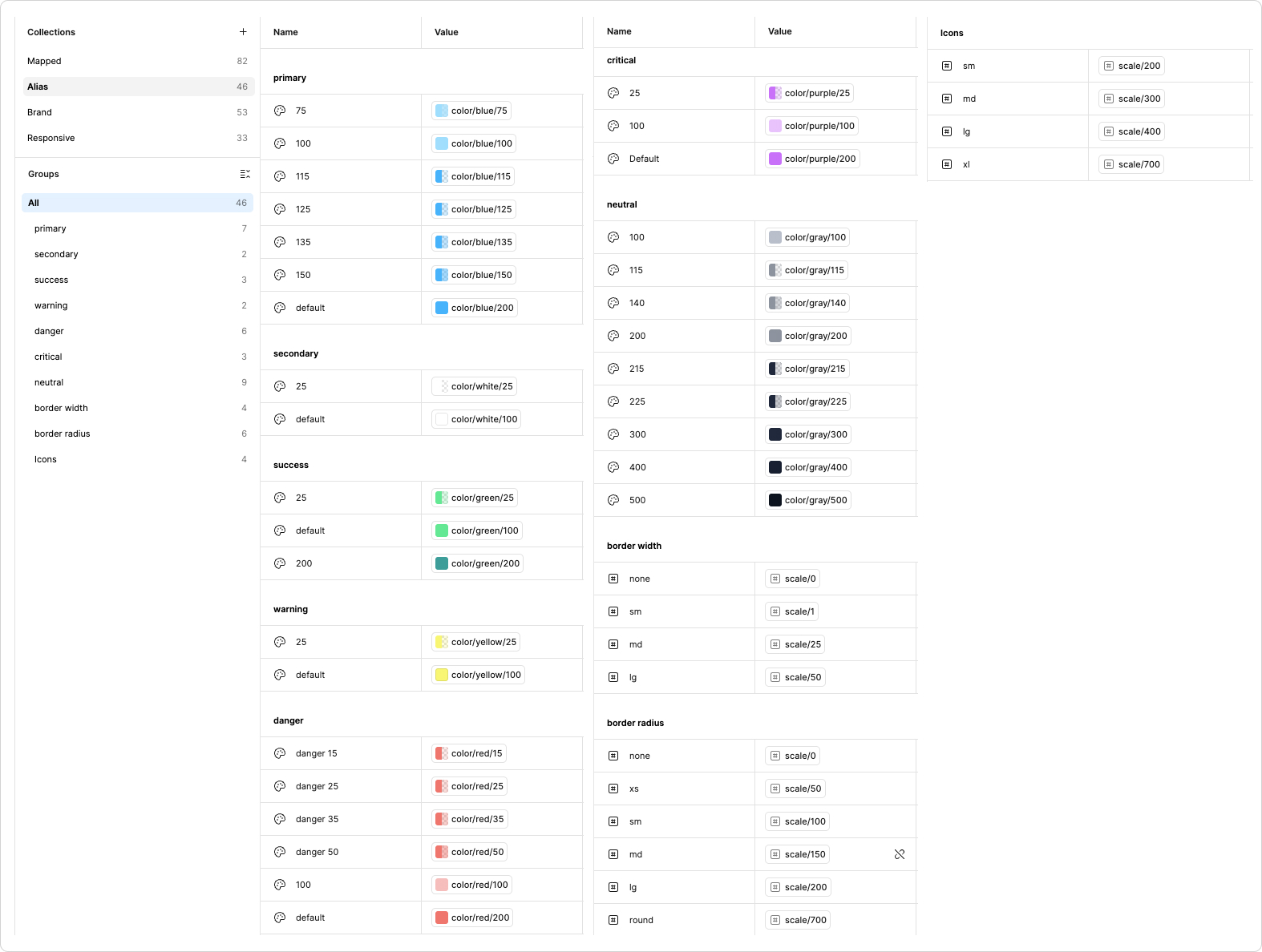
New Alias Variables
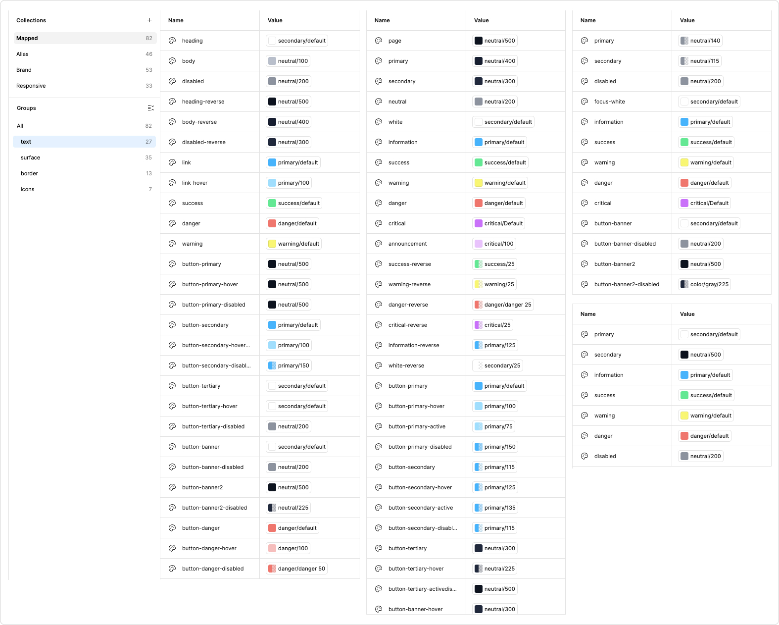
New Mapped Variables (Text, Surface, Borders, Icons)
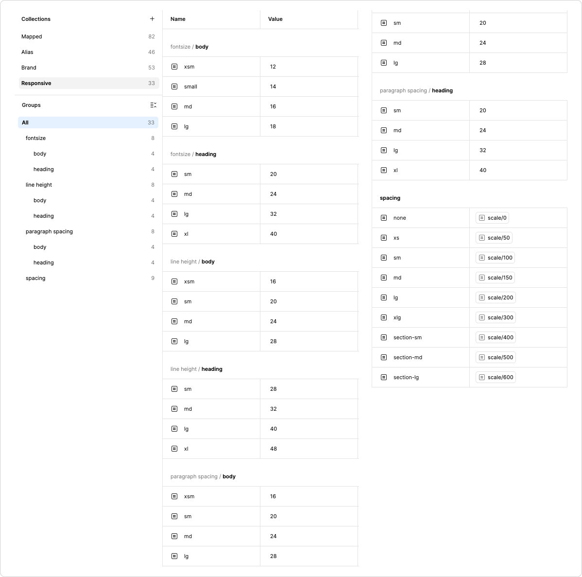
Responsive (Font & Spacing)
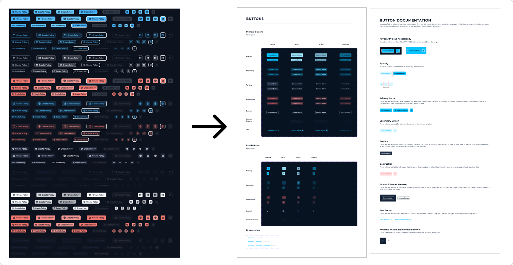
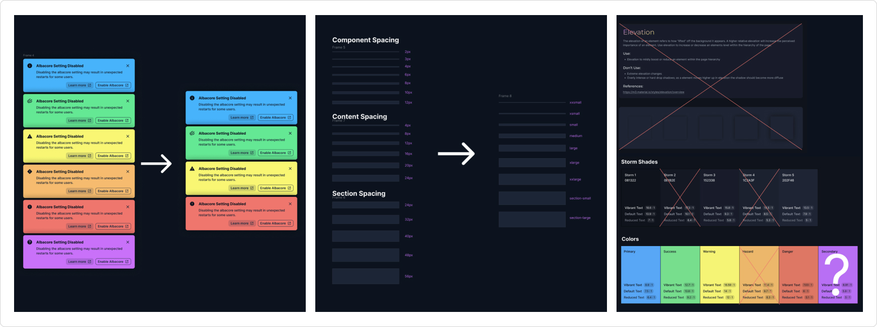
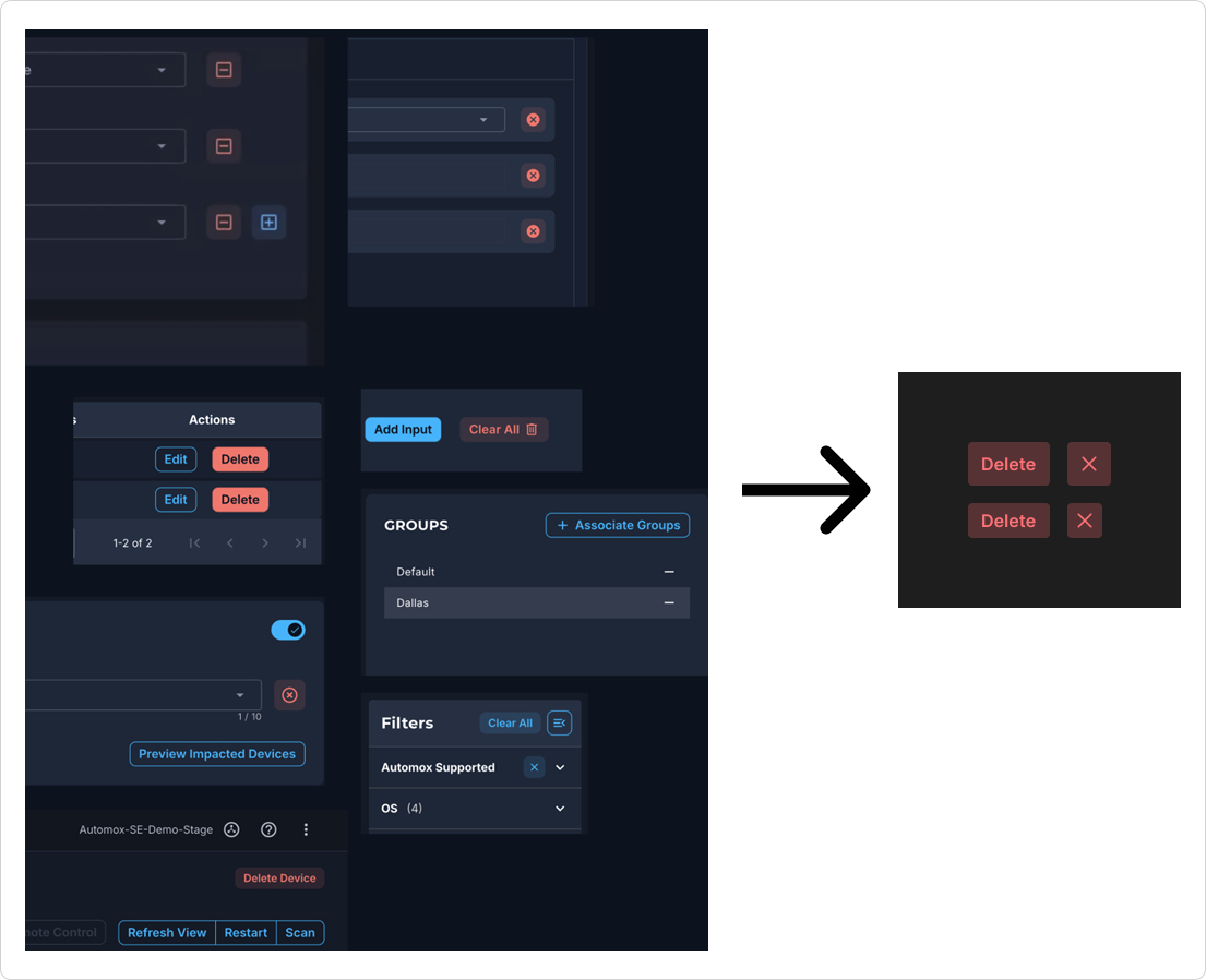
Refining Components & Defining Patterns
- Reduced Component Bloat: Trimmed standard button types by 36%, alert types by 33%, and destructive patterns by 82% for a leaner library.
- Spatial Discipline: Halved the spacing scale (from 18 to 9 sizes) to enforce layout consistency.
- Visual Refinement: Audited and merged "look-alike" components and random color choices into a unified, tokenized palette.
- Usability: Removed visual friction by standardizing distinct component patterns.
Component Optimization & Documentation
Standardizing the component library through comprehensive audits and end-to-end documentation.