Bloom UI Design System
Problem
Before its acquisition by CVS Health, Oak Street Health utilized two distinct custom applications, Canopy 1.0 and Canopy 2.0, for its care teams to access information from a backend electronic medical record (EMR). These applications, while both interacting with the same EMR, were developed independently and lacked any functional or aesthetic integration. Depending on the role of the care team, they were either required to use one or both of these applications simultaneously.
This separation created a disjointed user experience. Users faced separate learning curves for each application, as they shared no cohesive branding, voice, or design patterns. Furthermore, Canopy 1.0 lacked the UX support that Canopy 2.0 slightly received, resulting in an unstandardized and inconsistent interface across both applications.
Challenge
Create a custom Design system from the ground up.
Opportunity
Creating a new design system from the ground up presents a unique opportunity to establish a cohesive and effective user experience for Oak Street Health, all while adhering to the existing brand guidelines. This initiative will focus on several key areas:
- Research-based patterns: We'll ensure all design patterns are rooted in thorough research, leading to intuitive and efficient user flows.
- Accessibility: The system will be built to WCAG standards, guaranteeing an inclusive experience for all users.
- Beautiful and functional interface: We'll prioritize crafting an interface that is both aesthetically pleasing and highly functional, enhancing user satisfaction and productivity.
- Seamless team adoption: The design system will be easy for various teams to incorporate, promoting consistency across all products and platforms.
- Flexibility and reusability: It will be flexible enough to accommodate the specific customization needs inherent in healthcare, yet strict enough to ensure easy user adoption and efficient developer reusability.
Product Audit and Research
My audit of the application involved a comprehensive, section-by-section review to identify existing user flows and design patterns. This process included:
- Pattern and Flow Analysis: Examining each section to identify recurring design patterns, as well as inconsistencies.
- Accessibility Evaluation: Assessing the application against established accessibility guidelines to identify areas for improvement.
- Research Review: (When available) Delving into past research to understand the rationale behind previous design and development decisions.
- Gap Identification & Prioritization: Documenting "blank spots" or unanswered questions that emerged during the audit, which require further user testing or research to clarify.
- Atomic Design Framework Application: Utilizing the atomic design methodology, I reviewed the foundational "atoms" and "molecules" of the interface. This allowed for a prioritized approach to addressing core inconsistencies and strategizing the future development of more complex "organisms" within the system.
1.) Inconsistent Styles & Visual Queues
2.) Does not follow ADA and WCAG standards for accessibility
3.) Unidentifiable Actions
4.) Confusing Hierarchy and Information Pairing
5.) Inconsistent Patterns across platforms
*To name a few at a glance items discovered in auditing.
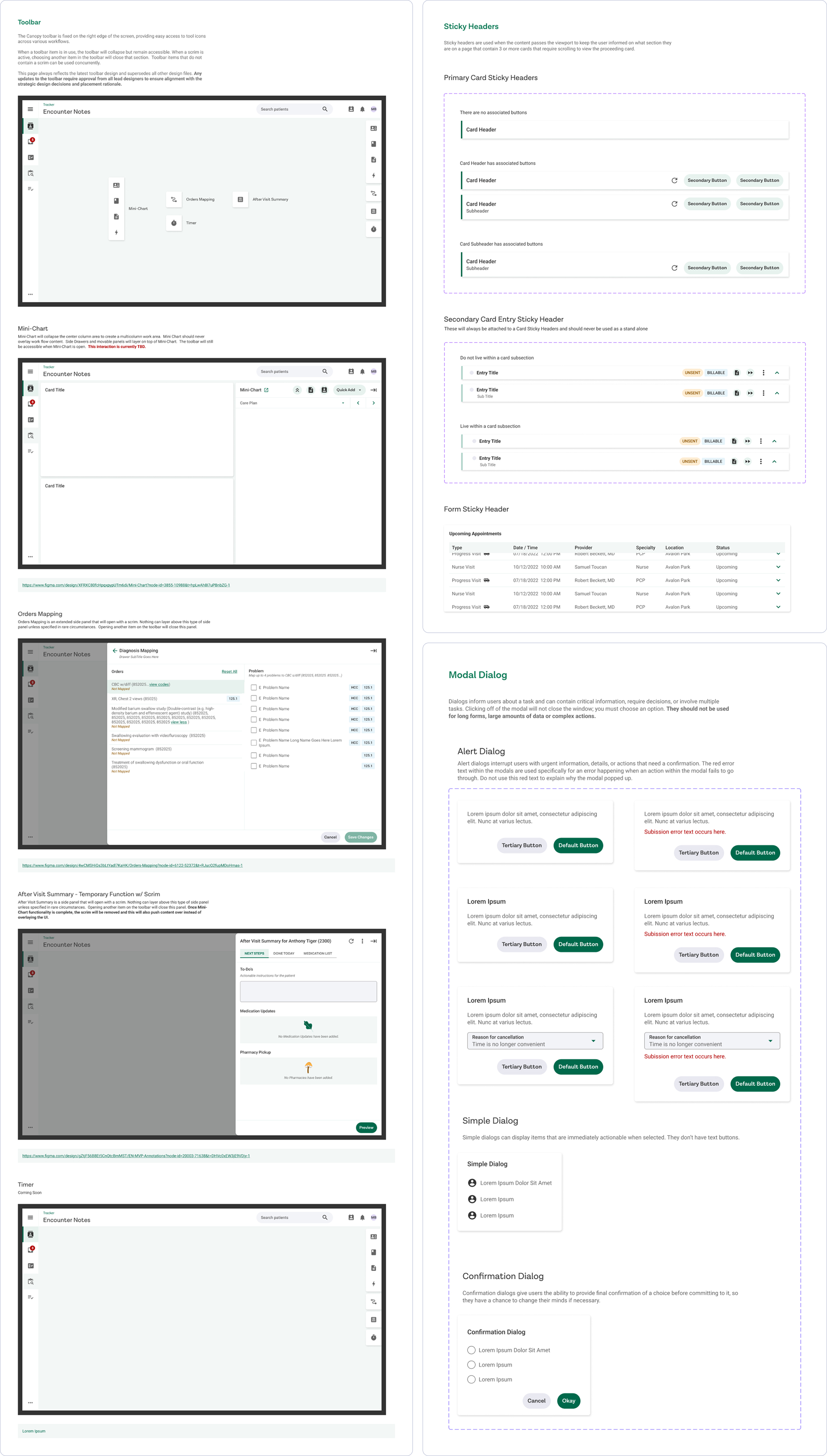
The Design System
Bloom UI is built upon the Atomic framework, comprising Atoms, Molecules, Organisms, and Templates. The Figma file provides comprehensive documentation on when and how to use each component. It also features a dedicated styling page for developers and a Keyboard Focus section outlining styles for keyboard interactions.
While the Figma file primarily serves designers and Product Managers, we've also developed a Storybook component library. This library addresses developer-specific requirements that aren't necessary for inclusion in the design files.
Each component within Storybook comes with a strict developer checklist. This ensures not only correct implementation but also adherence to WCAG guidelines and responsive styling best practices.
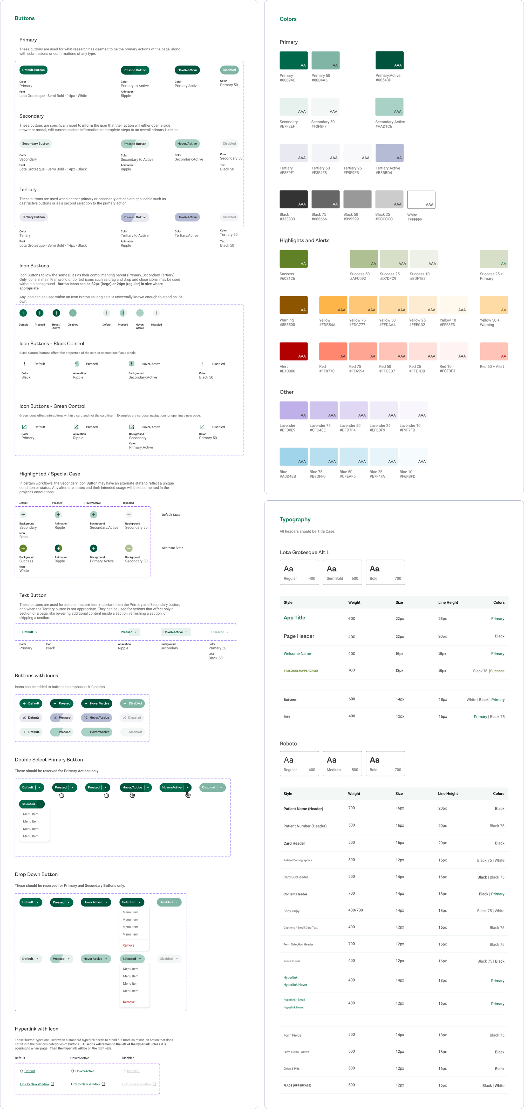
Bloom UI Design System Component List
Atoms
- Buttons
- Chips
- Color Guide
- Icons
- Selection Controls
- Tabs & Steppers
- Loaders
- Tags, Badges & Statuses
- Tooltips
- Typography
Molecules
- Accordions
- Alerts Errors & Warnings
- Bottom Sheets
- Cards
- Drag & Drop
- Drop Menus
- Empty States
- Misc
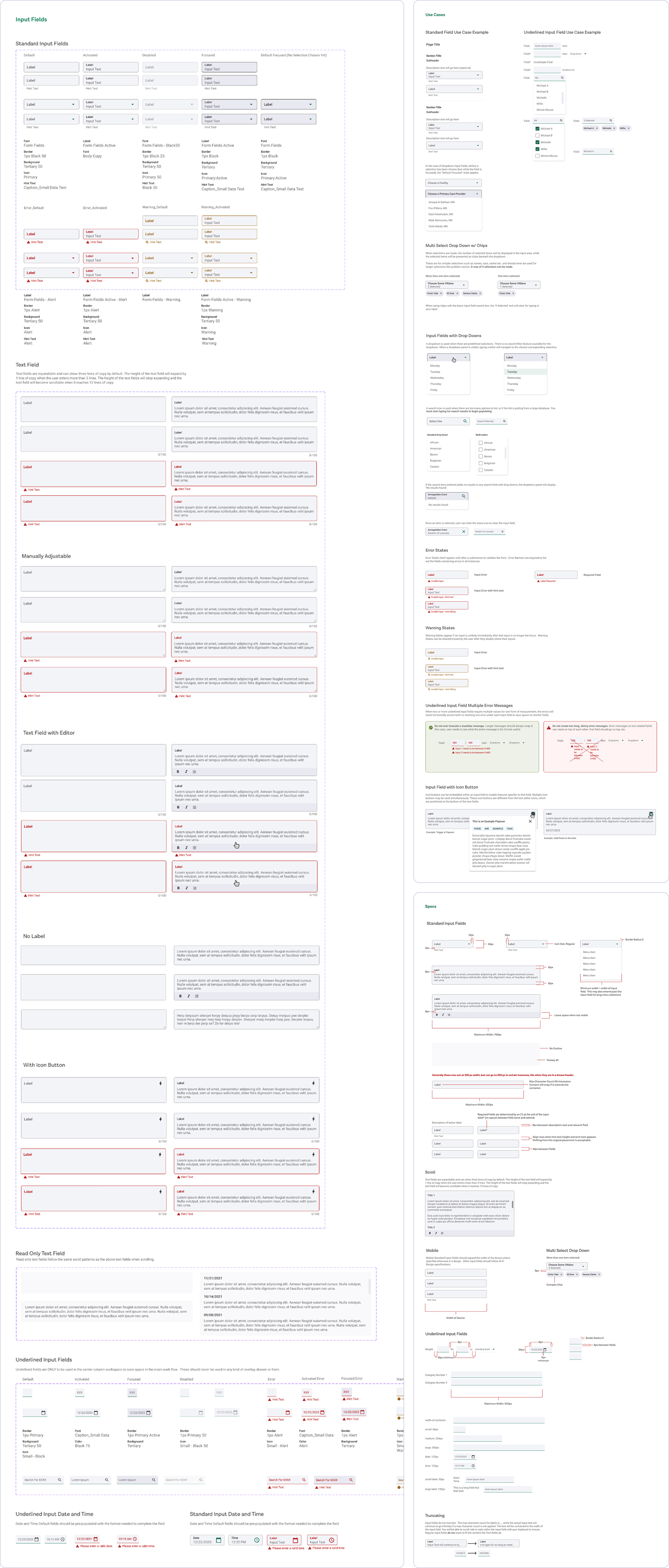
- Input Fields
- Locking
- Modal Dialogs
- Movable/Floating Panels
- Notifications
- Patient Avatars
- Popovers
- Search Fields
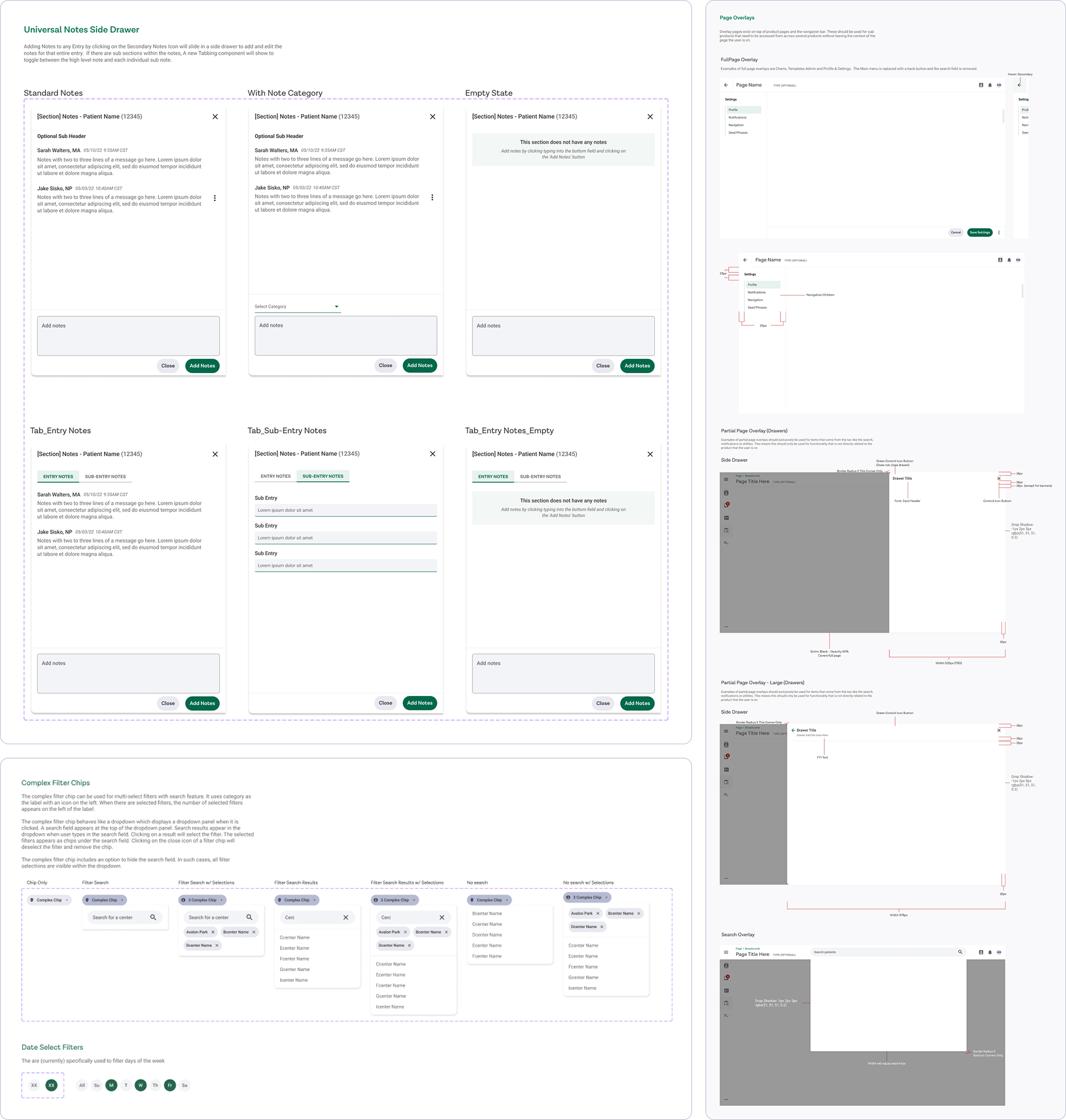
- Side Drawers
- Sticky Headers and Footers
- Time & Date Pickers
- Toolbar
Organisms
- Data Tables & Grids
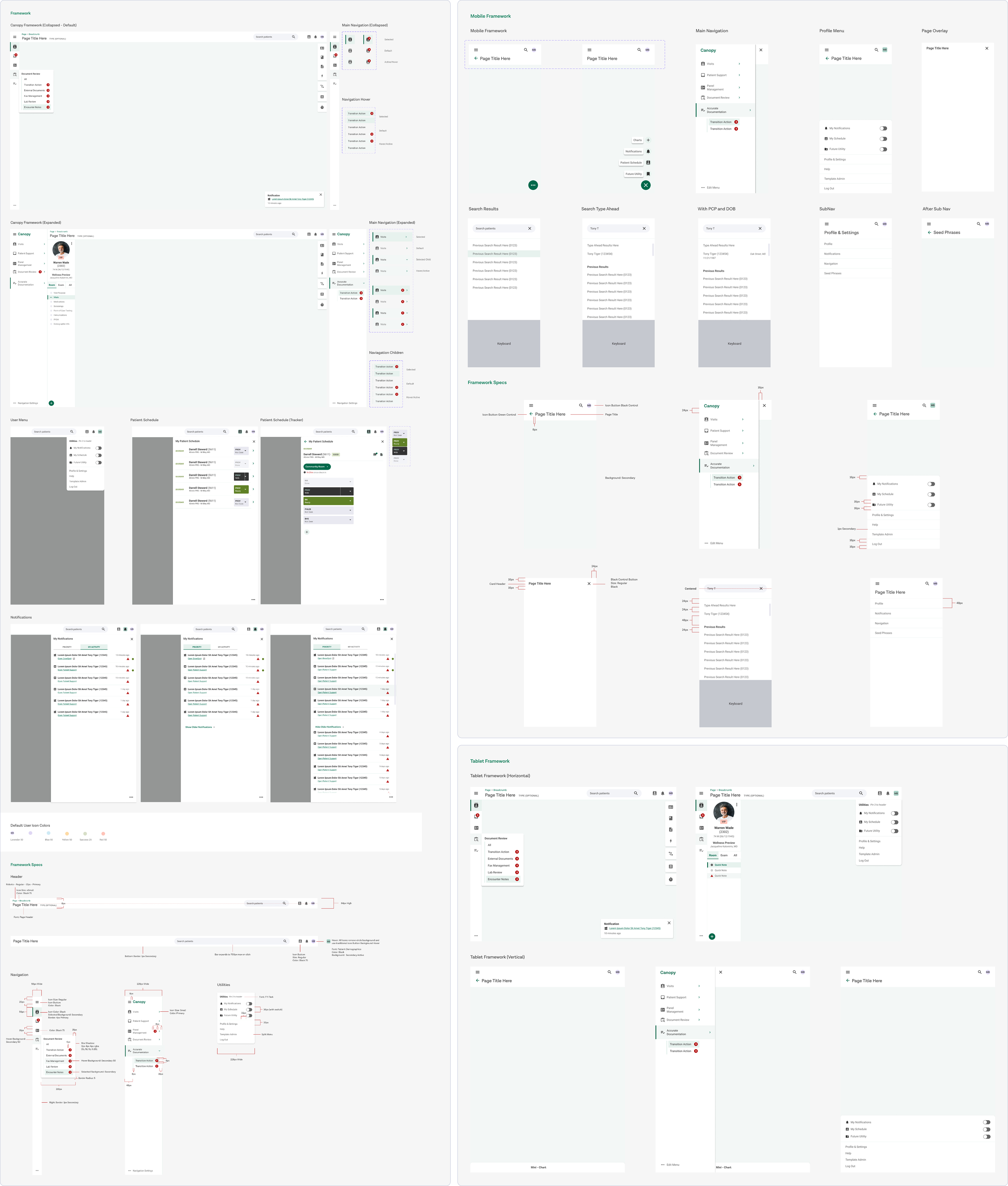
- Framework
- Filters
- Mini-Chart
- Notes / Comments
- Page Overlays
- Patient Sidebar
- Photo Capture
- Seed Phrases
Guidelines
- Animation Guide
- Copywriting Guide
- Illustration Guide
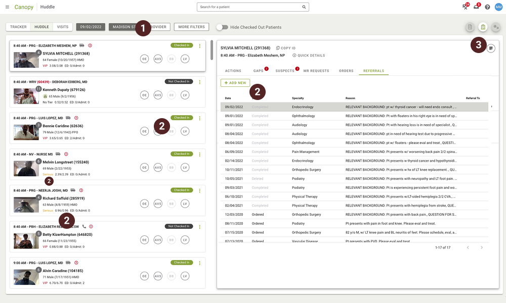
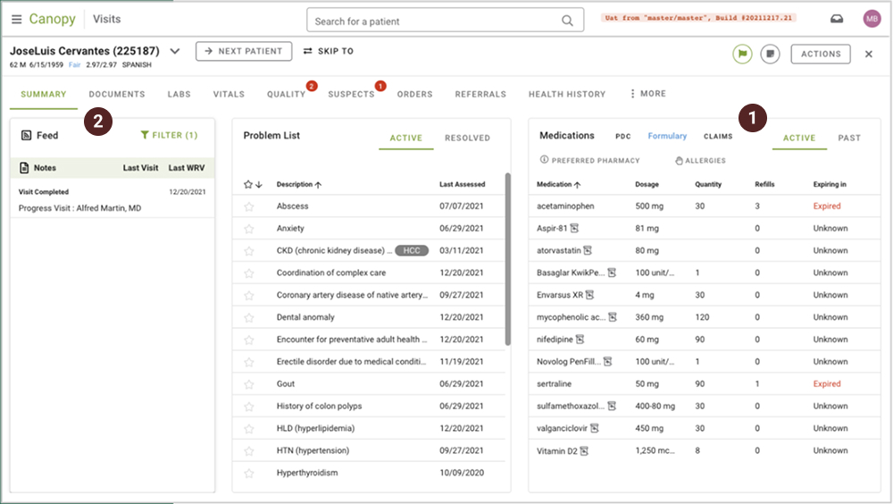
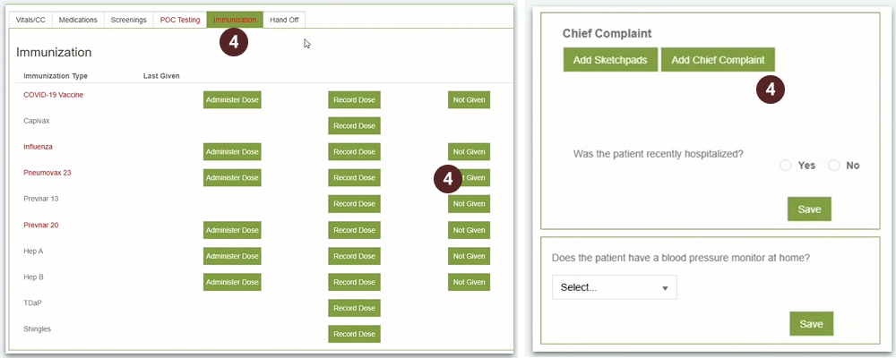
Components in Action
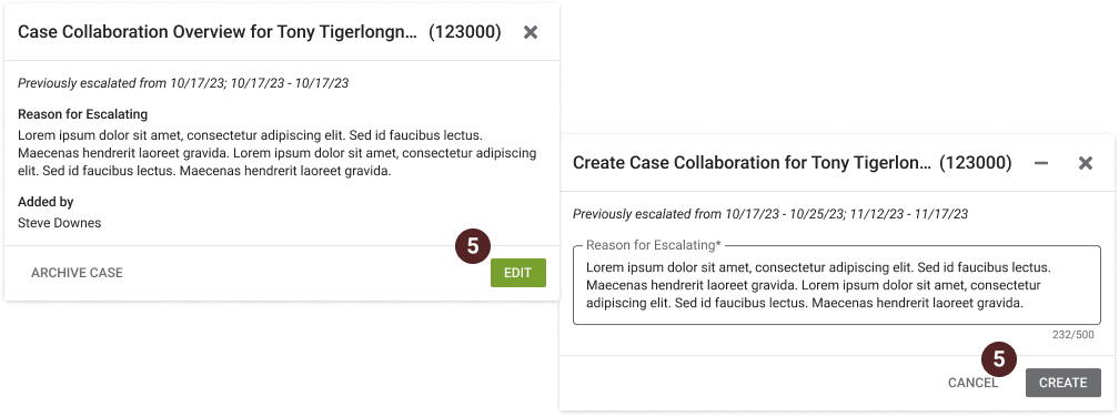
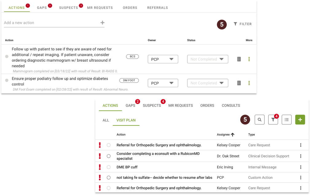
Every screen prioritizes a clear visual hierarchy, making the primary task on each page immediately obvious. Users will find all actions to be clearly identifiable. While each section is tailored to a specific workflow, all areas follow the same design patterns, allowing for easy user adaptation and a smooth learning curve.
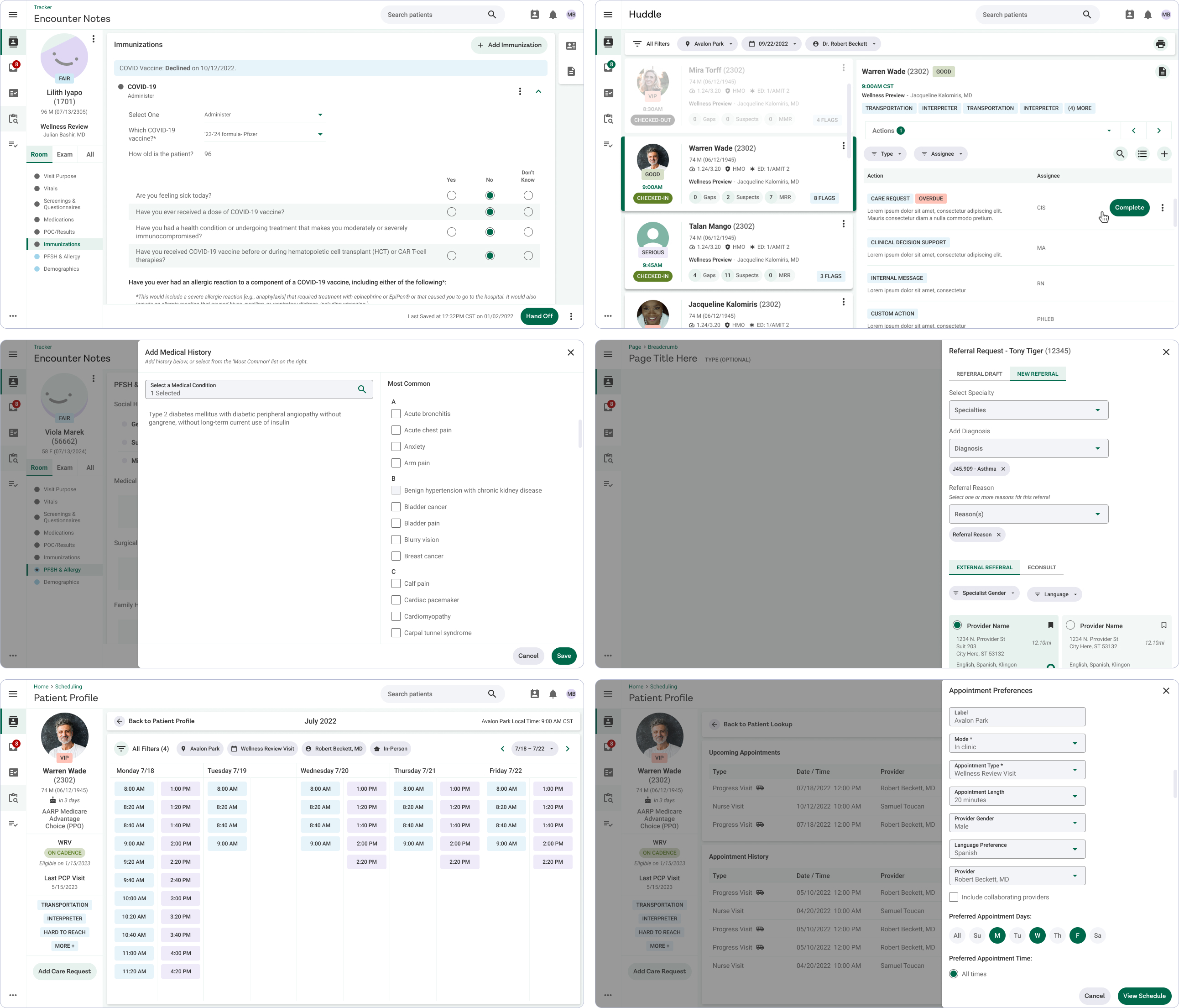
Glimpses of a Complex System
How Users Responded
Once Bloom UI was in a good spot, we launched a few applications utilizing the new design system. We then conducted thorough testing with various users in different roles to understand how the product would affect specific teams.
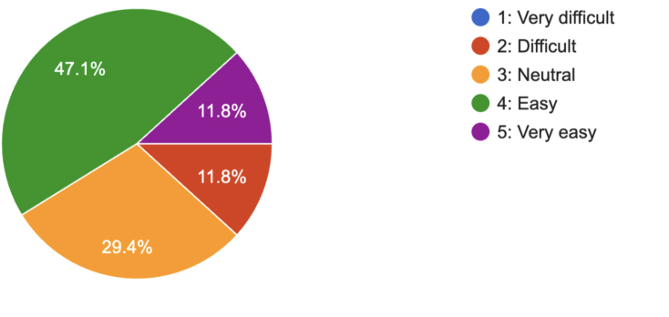
Overall Ease of Use
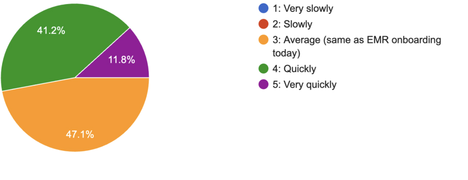
How Quickly Users Could Adopt (Opinion)
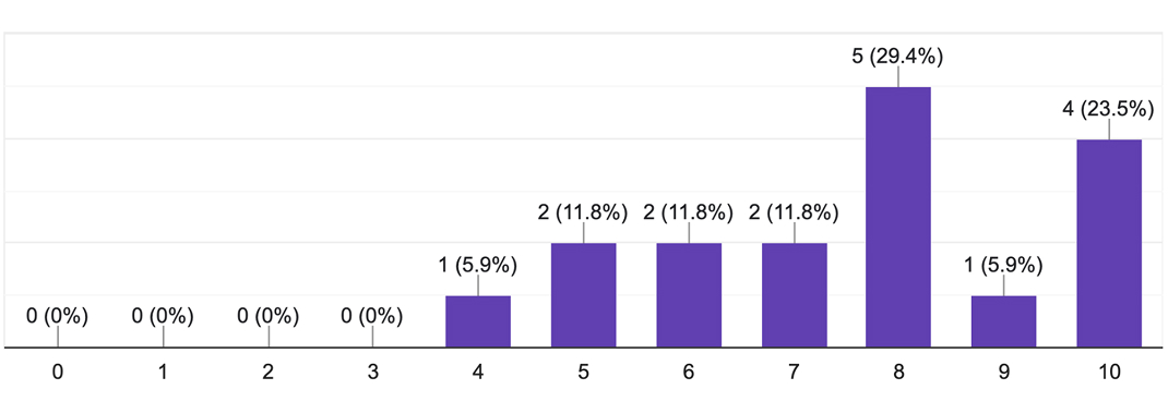
Company-wide rollout recommendation
Constant Development & Communication
Design systems are dynamic, always improving, and never truly complete. We'll continue to iterate and refine ours well into the future, driven by ongoing testing, user feedback and new technologies.
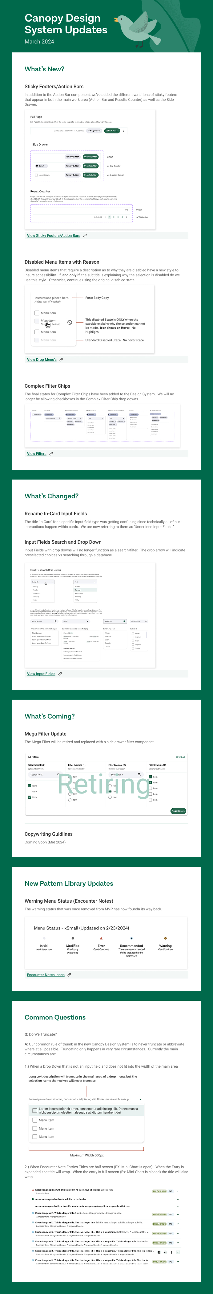
Newsletter
As one example of conatsant communication, this newsletter was distributed to specific mailing lists monthly to keep relevant teams updated, as well as thorough internal walk throughs with the design teams.